Custom Logo & Poster Design for "Summertime" – Short Video Project
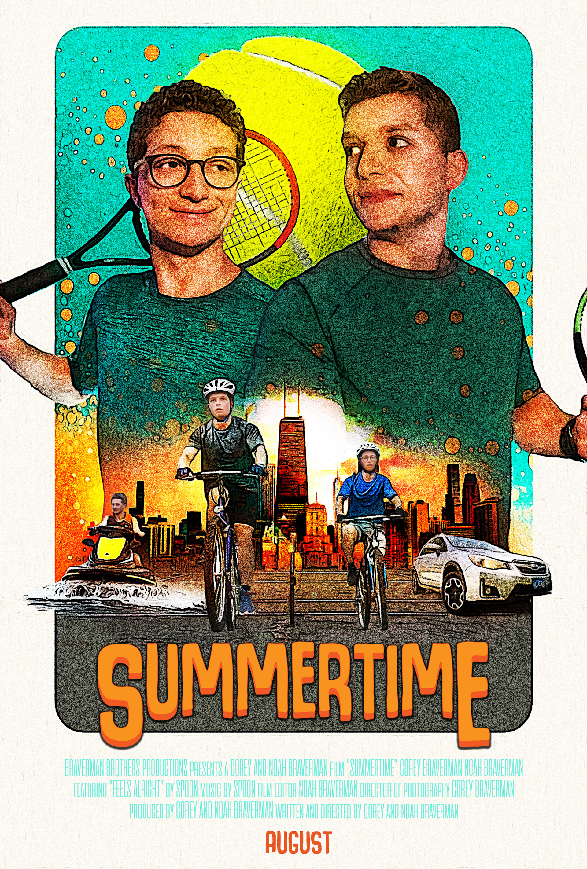
“Summertime” is a short video project developed in collaboration with my brother, capturing the essence of how we spent our summers growing up—and how we still envision the perfect summer today. From backyard games to road trips and late-night laughs, it’s a love letter to youthful freedom and shared memories. I created a custom logo and poster to serve as the visual glue that held the project together, adding a burst of personality and cohesion to the final video experience.
Process:
While the project was rooted in fun and nostalgia, I approached the branding with the same thoughtfulness I bring to any client work. I started by reflecting on the tone of the film: warm, spirited, and a little bit wild. I knew the visuals needed to feel just as vibrant.
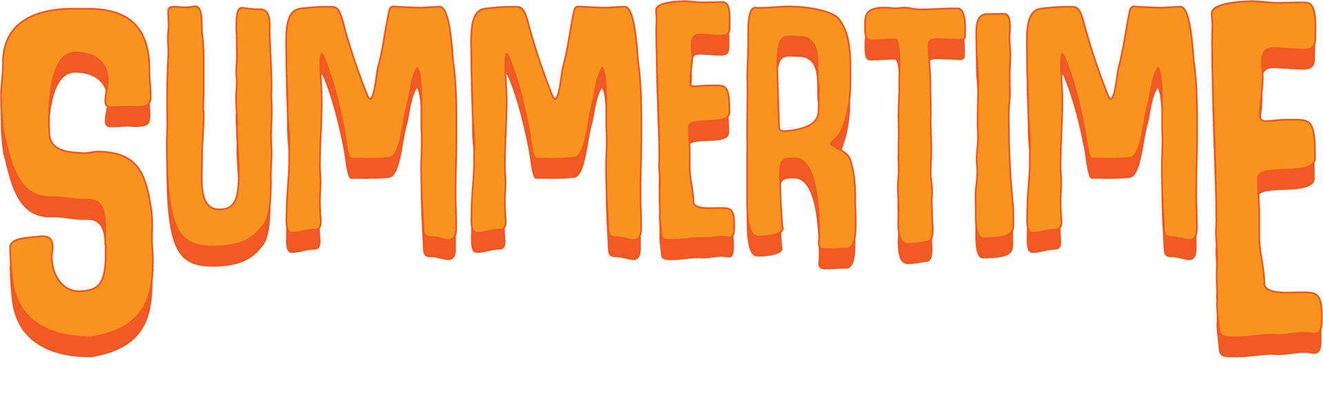
I selected orange as the primary color based on its associations in color theory: it represents energy, warmth, enthusiasm, and creativity—all key ingredients of a memorable summer. Orange also evokes adventure and friendship, setting the emotional tone before a single frame rolls.
The typeface I chose leans into retro-summer aesthetics—bold yet playful, nostalgic yet timeless. It channels everything from surf posters and old-school soda ads to the feeling of sunshine on your back. The result is a logo that’s both eye-catching and emotionally resonant.
To complete the package, I designed a companion poster that brings the identity to life, using stills and motifs from the video itself. This poster helped elevate the project from a fun sibling video into a storytelling piece with a signature style and lasting impact.
This piece gave me the chance to explore personal storytelling through a design lens, applying identity design to a deeply familiar subject. It reminded me that even small, passion-driven projects deserve to look and feel like something special—because they are.