
Reimagining Rush: A Brand Identity Rooted in Science Fiction and Musical Evolution
Rush’s journey has always been defined by transformation—constantly evolving their sound, their performances, and their artistic vision. With deep roots in Anglo-American literature and science fiction, their late '70s and '80s albums embraced the weird and unconventional, influencing generations of musicians across genres. This redesign was a chance to distill that legacy into a bold, immersive brand identity that honors their past while embracing their fearless creative future.
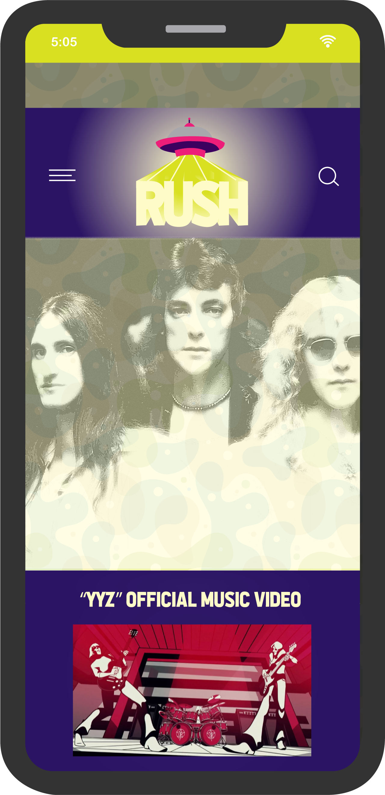
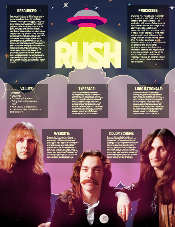
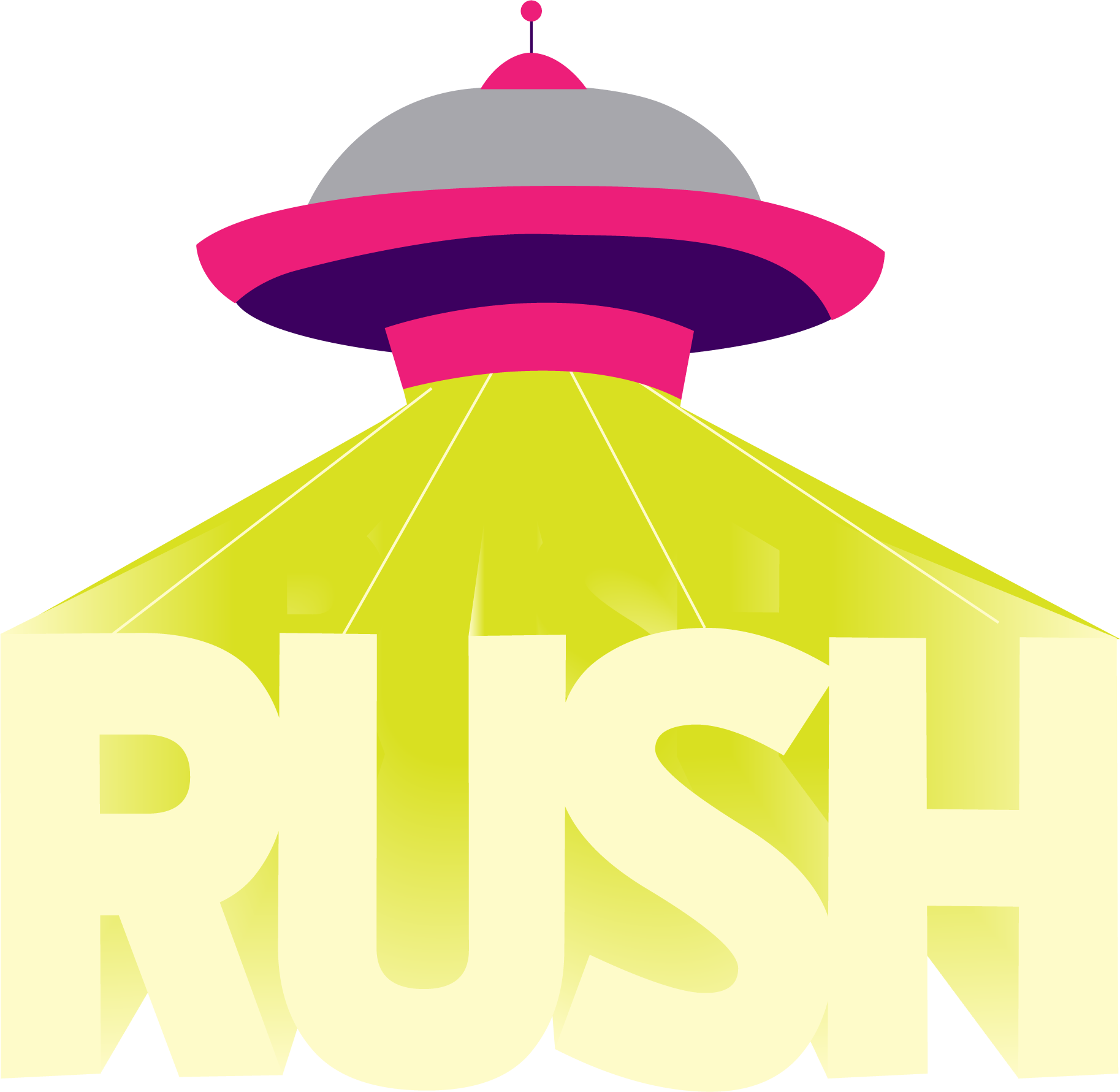
The foundation of this project was their music—its ability to defy expectations and inspire creativity in others. Using All the Way to the Sun as the primary typeface, the design captures the explosive and ambitious spirit that has defined Rush from the start. The choice of an alien spacecraft beaming down the logo speaks to the band's fascination with the unknown—symbolizing how their passion for science fiction and genre storytelling shaped their artistic DNA.
This redesign isn't just a tribute—it's a reinvention. It reflects Rush’s ability to transcend boundaries, push creative limits, and continuously redefine what music and artistic expression can be. The result is a brand that embodies their commitment to innovation, ambition, and the unexpected.
Process:
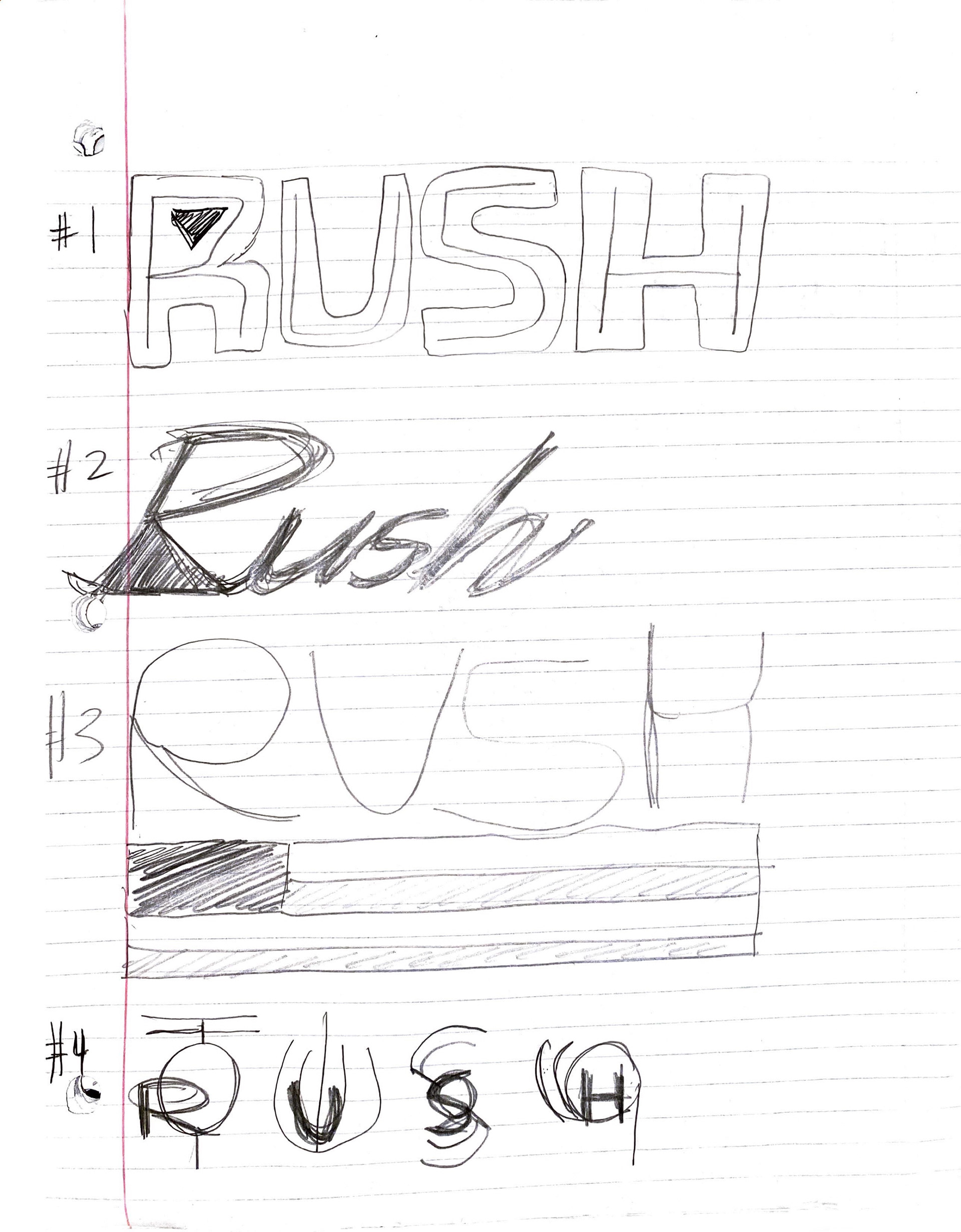
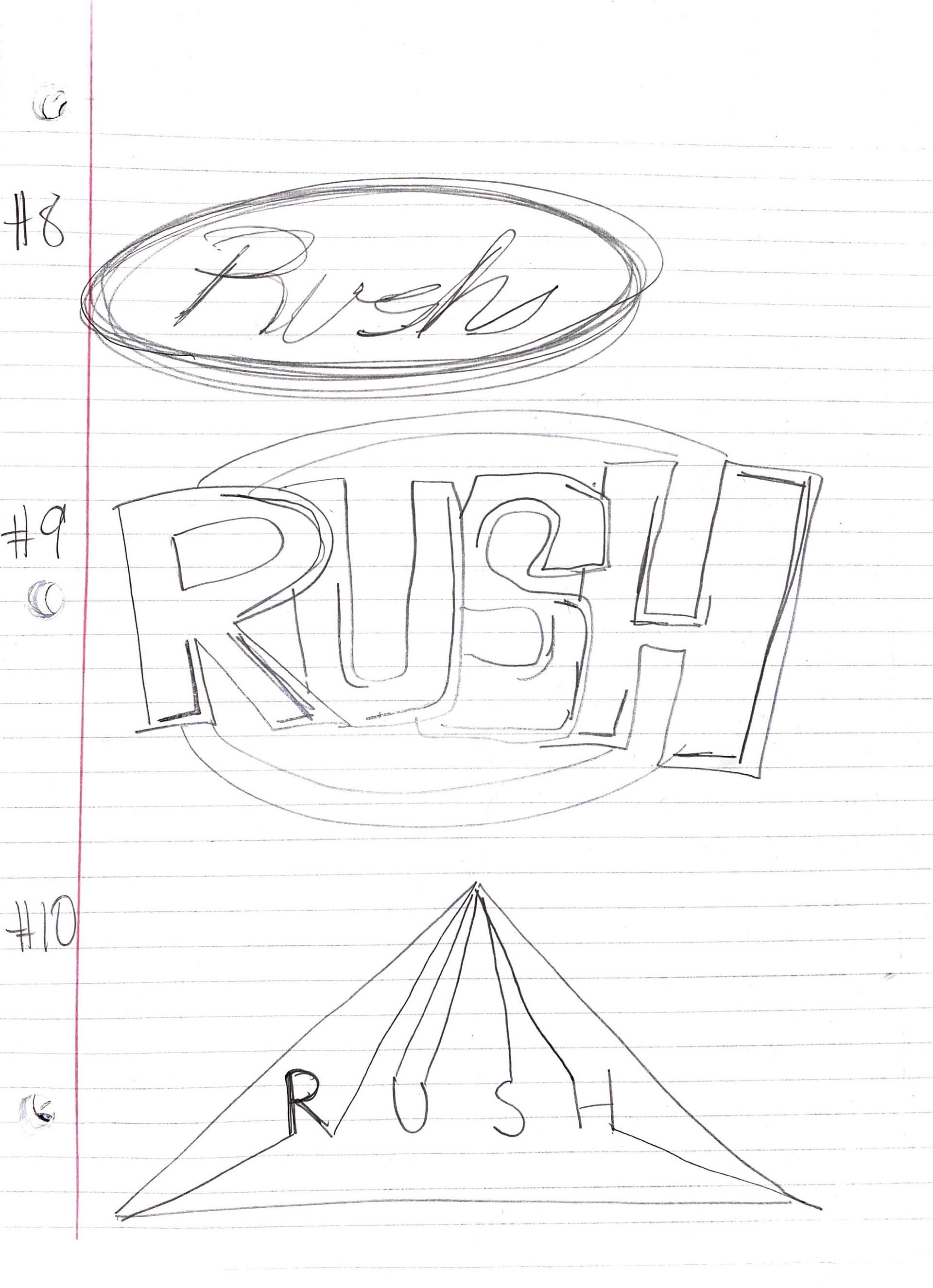
My design process began with an exploration of Rush’s evolution—both musically and visually. While the band had an iconic presence, their brand identity had never fully embraced the eclectic and science fiction-inspired essence woven into their music. Understanding their artistic DNA was key to developing a logo that both honored their legacy and projected their future.
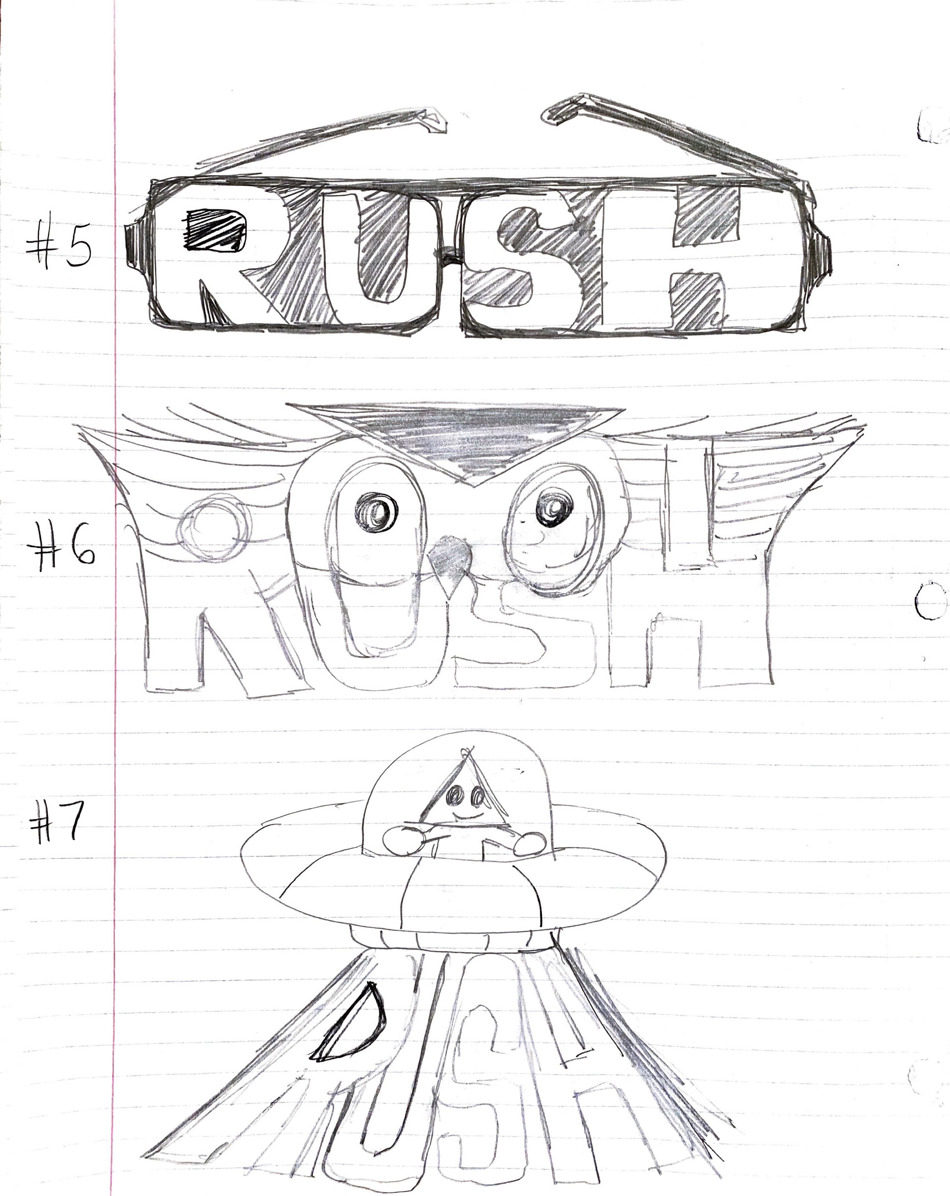
With this foundation, I moved to sketching. Inspired by Rush’s fascination with the unknown, I played with elements that captured the surreal and extraterrestrial. The concept of an alien spaceship beaming down the logo emerged as a perfect metaphor—symbolizing how science fiction and unconventional creativity fueled the band’s journey.
The typeface choice was equally intentional. All the Way to the Sun balances the bold, explosive energy Rush has always embodied while adding a modern, ambitious edge to their evolving brand. It embraces their fearless approach to experimentation and risk-taking.
Color theory played a major role in refining the aesthetic. Bright, electric tones reflected the intensity and energy of their music, while simple geometric shapes added a sense of structured chaos. I used glow effects and layered textures to reinforce the otherworldly theme without overwhelming the core visuals.
Once the logo was finalized, I extended the design into a mobile homepage concept that translates the brand into an immersive digital presence—capturing Rush’s relentless innovation in a modern, visually dynamic format.