Crafting a Personal Brand Identity – Noah Braverman
For a design course at Miami University, I was tasked with developing a personal logo that would serve as a visual embodiment of who I am—capturing not only my personality and values, but also how I aspire to be perceived professionally and creatively.
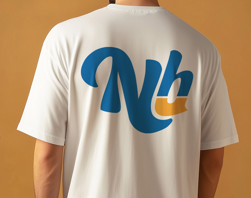
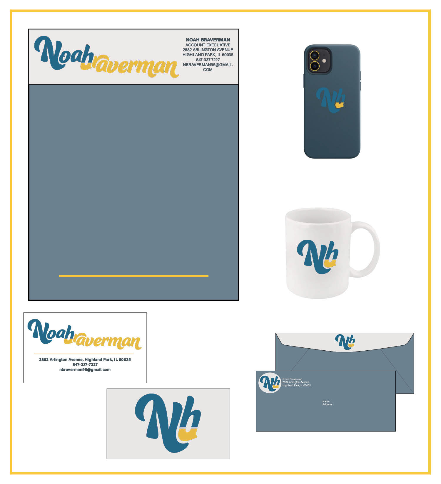
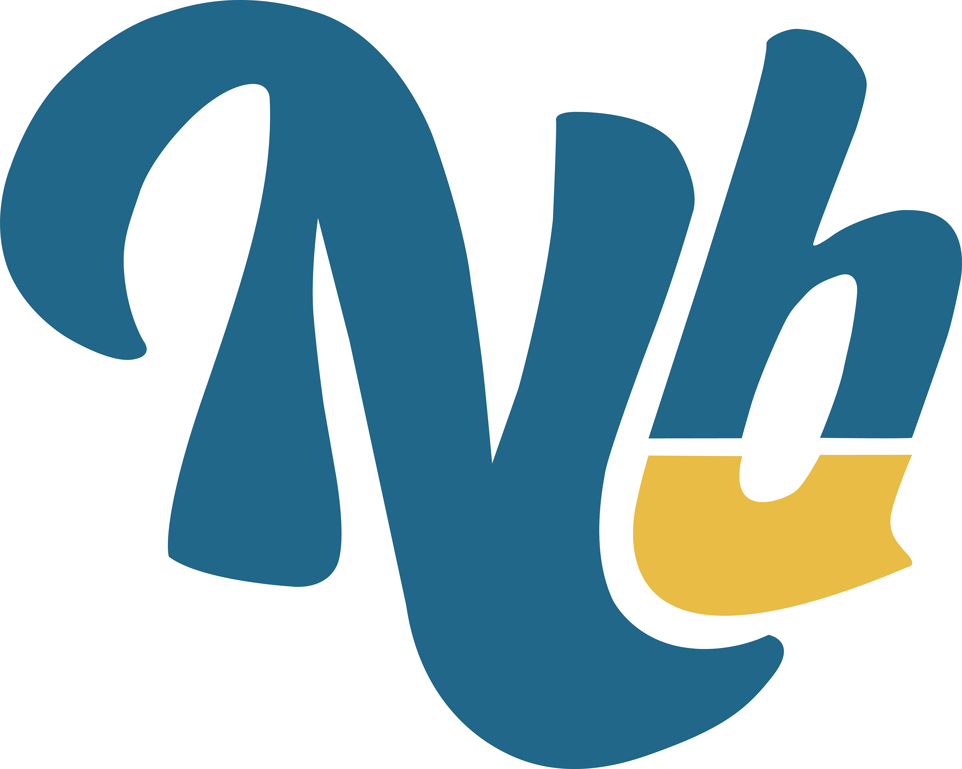
To represent this balance, I constructed a custom logomark by slicing the “B” from Braverman in half and merging it seamlessly with the “H” in Noah. The result is a letterform that simultaneously reads as both initials—a visual representation of personal harmony between chaos and clarity.
From the primary logo, I developed a versatile “social” icon optimized for profile images and quick brand recognition. I also showcased mockups of the logo on business cards and apparel—giving the system real-world context and demonstrating how personal identity can evolve into a unified and scalable brand.
This project gave me the opportunity to apply strategic identity design to the most important brand I’ll ever work on: my own. It pushed me to articulate who I am through form, color, and concept—a powerful reminder that the best design isn’t just about visuals, but about meaning.
Process:
As with any branding project, I began with research. This time, the client was me. I conducted a deep self-interview, exploring past experiences, personal values, and future goals. I discovered an important duality in how I approach the world: I’m adventurous and spontaneous, yet equally drawn to structure and intentionality. Once I had that information locked down, I moved to sketching and playing around with various fonts in Illustrator, until I finally cracked it.
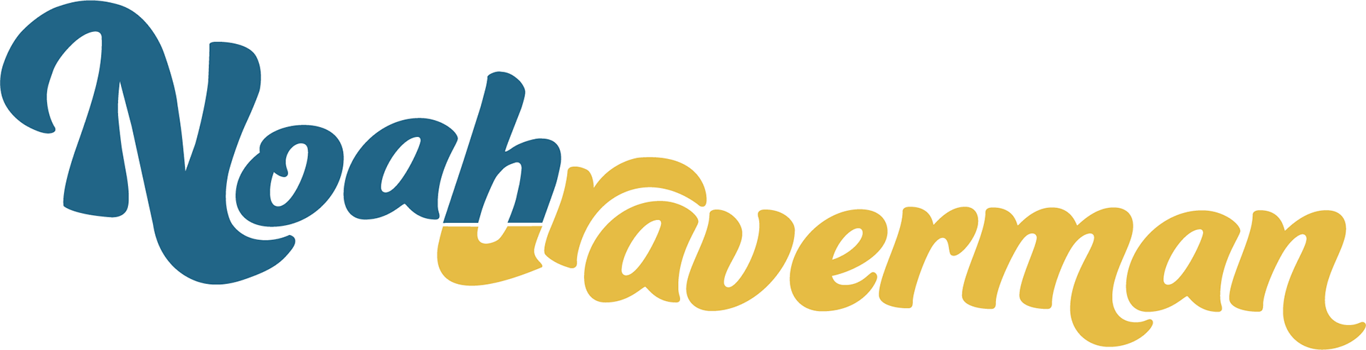
The logo is supported by a custom-selected typeface that expresses individuality, movement, and creativity—qualities I strive to bring into every project. For the color palette, I chose teal to convey a sense of calm and stability, paired with yellow-gold to evoke energy, optimism, and forward momentum.