Reimagining the Netherlands: Crafting a Dynamic Brand Identity
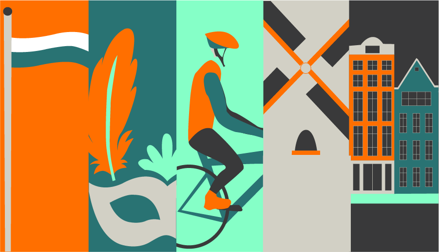
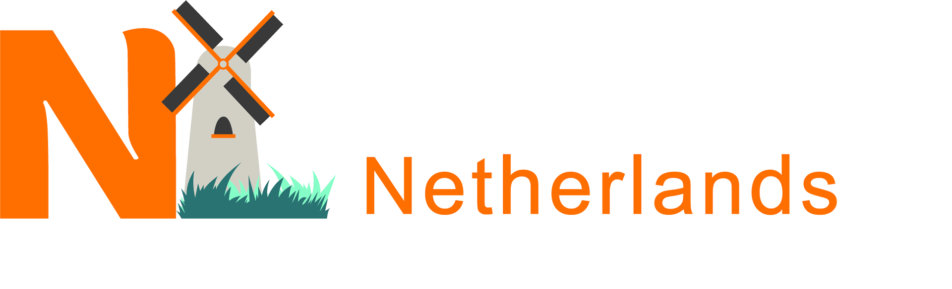
The Netherlands is a country defined by movement—its history, culture, and identity are constantly evolving yet deeply rooted in tradition. From its iconic windmills and tulip fields to modern sustainability initiatives and dynamic cityscapes, Dutch heritage is an intricate balance between the past and the future. This redesign captures that essence, blending historical symbols with contemporary design to create a flexible brand identity that reflects the Netherlands’ vibrance and adaptability.
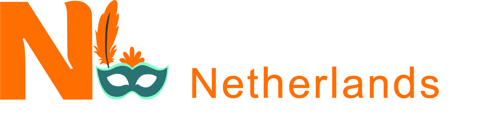
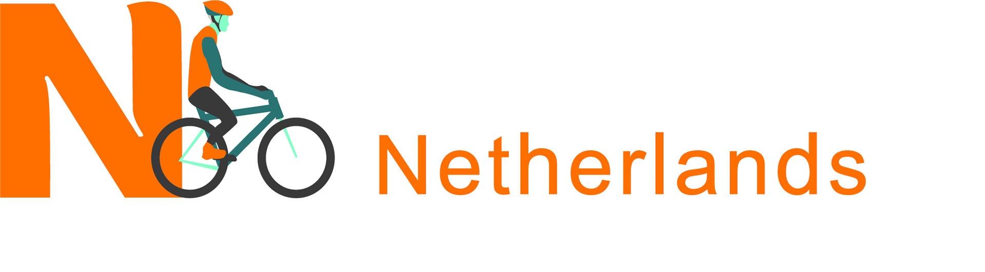
The foundation of this project was lived experience—the moments spent biking through Maastricht’s winding streets, indulging in crispy fries at Friedt, and celebrating Carnival alongside the Dutch community. Every element incorporated carries a piece of that reality, weaving a story that embraces national pride, local customs, and cultural nuance.
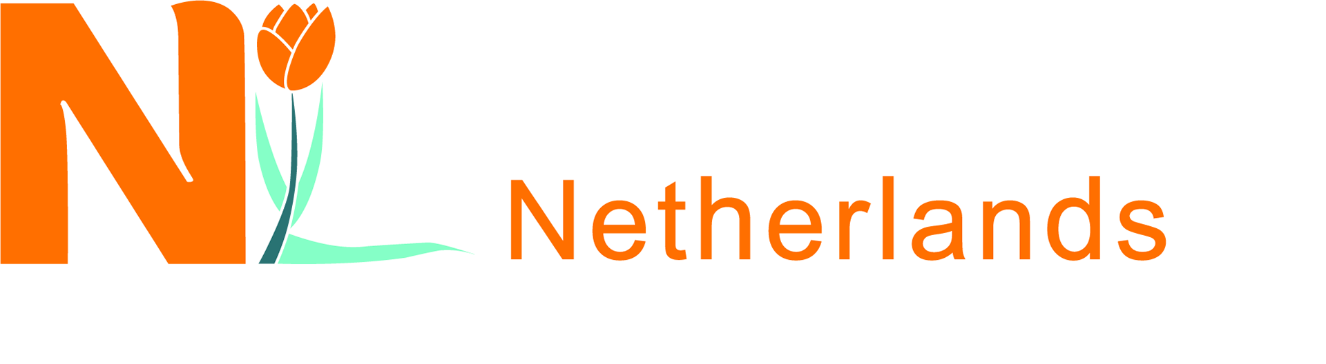
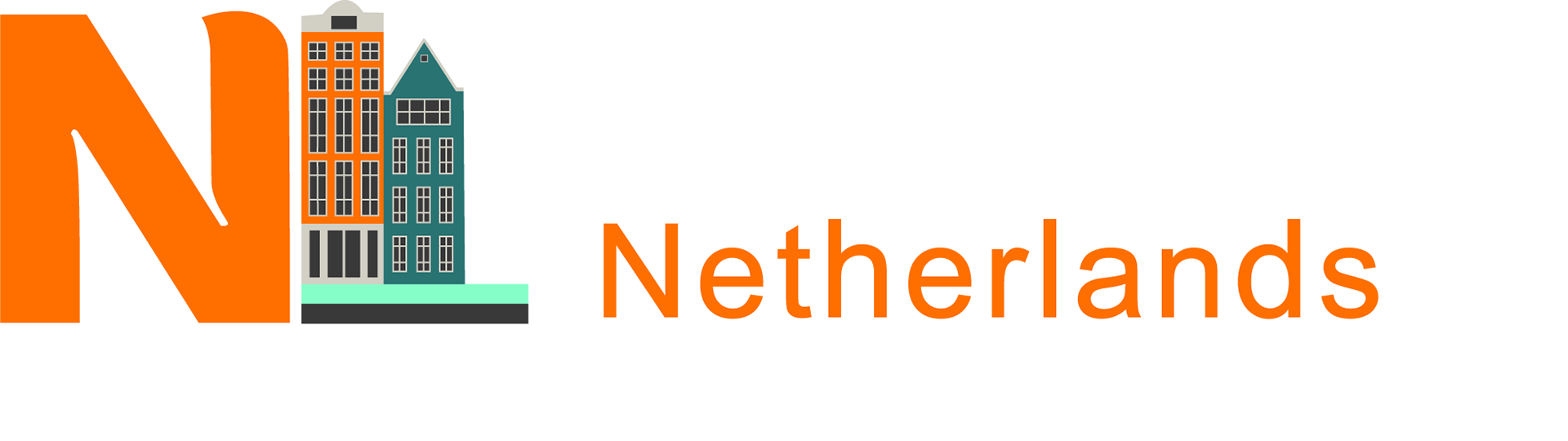
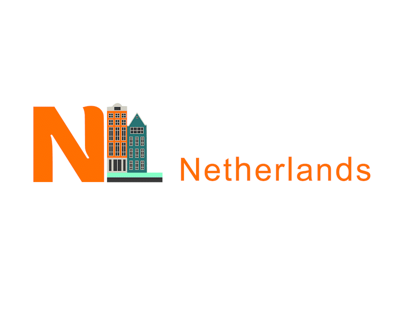
Typography plays a key role in bringing this vision to life. Inspired by the Netherlands' updated country logo from 2019, the font choice evokes both clarity and fluidity, much like the flowing canals of Amsterdam. Tulips—bright and abundant—symbolize joy and resilience, while the integration of a fry into the "L" speaks to the delightful everyday rituals that make Dutch culture unique.
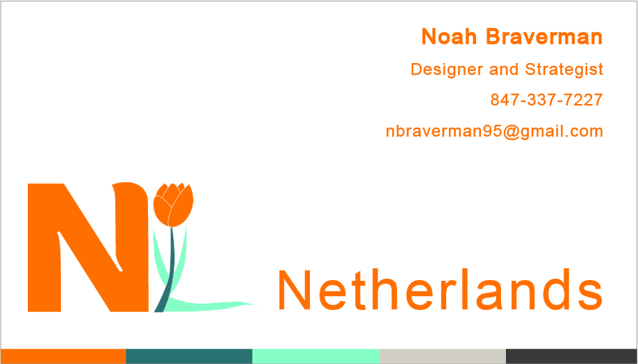
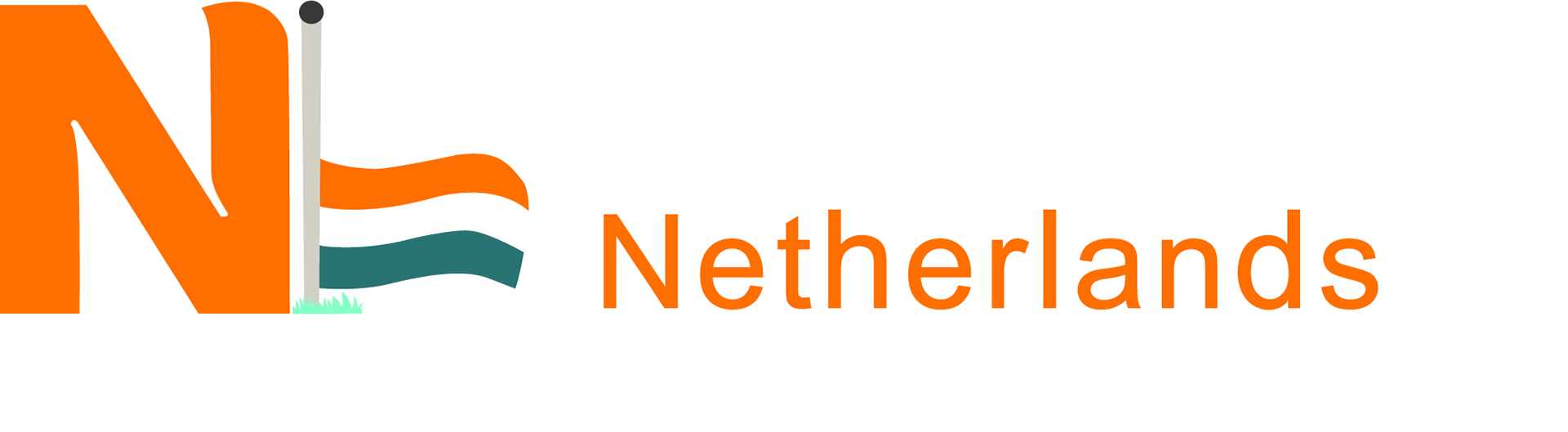
This redesign is more than a tribute—it is a celebration of movement, innovation, and identity. The adaptable nature of the Netherlands’ cultural landscape, from its embrace of green energy and cycling lifestyle to the unmistakable orange pride of its soccer team, reflects a nation continuously pushing boundaries while honoring its roots. Through a dynamic logo system and an official business card inspired by this design philosophy, the result is a brand that embodies the Netherlands in all its richness—a country that thrives on reinvention while staying distinctly Dutch.
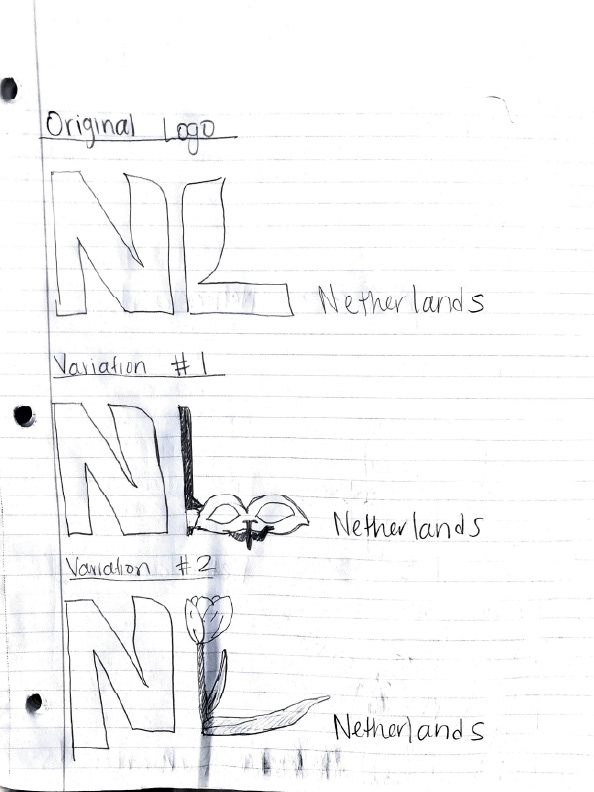
Process:
This dynamic logo system reflects the Netherlands’ evolving identity, inspired by my time in Maastricht. Through sketching and experimentation, I integrated key cultural elements—tulips, cycling, Carnival, canal homes, and national pride—to create adaptable variations.
The fry in the “L” nods to Dutch snack culture, while angled shapes capture Amsterdam’s unique architecture. Typography mirrors movement and fluidity, and bold orange honors Dutch soccer pride. Each version balances tradition with modernity, ensuring flexibility across applications.
The final system, including an official business card, embodies a country that thrives on reinvention while staying deeply rooted in its heritage.