
Elevating a 20-Year Oral Surgery Practice with its First Brand Identity:
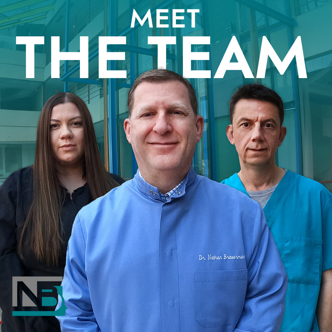
In December 2022, during a casual conversation with my dad—an Oral and Maxillofacial Surgeon—I learned that his practice, Highland Park Oral Surgery, would be celebrating its 20th anniversary in May 2023. Despite two decades of success, he had never developed a formal brand identity. This moment sparked a multi-month creative collaboration between the two of us, aimed not only at celebrating a milestone but also at establishing a professional and enduring visual identity for his business.
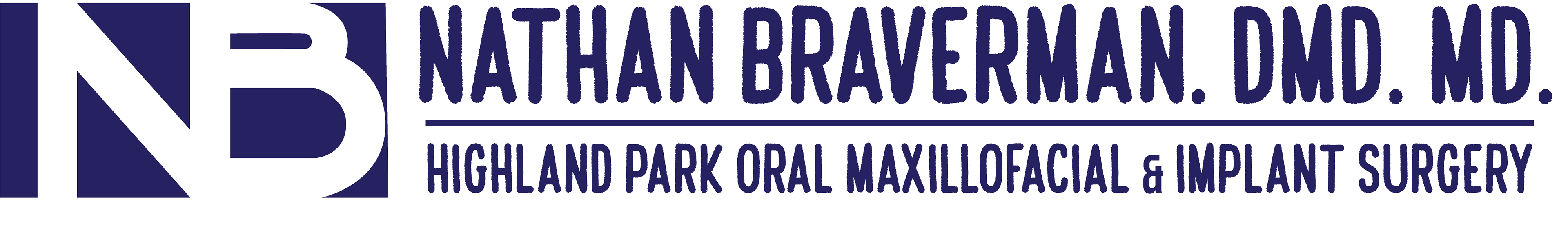
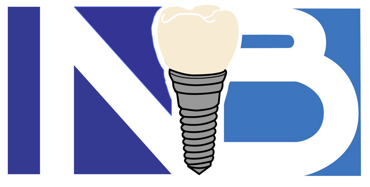
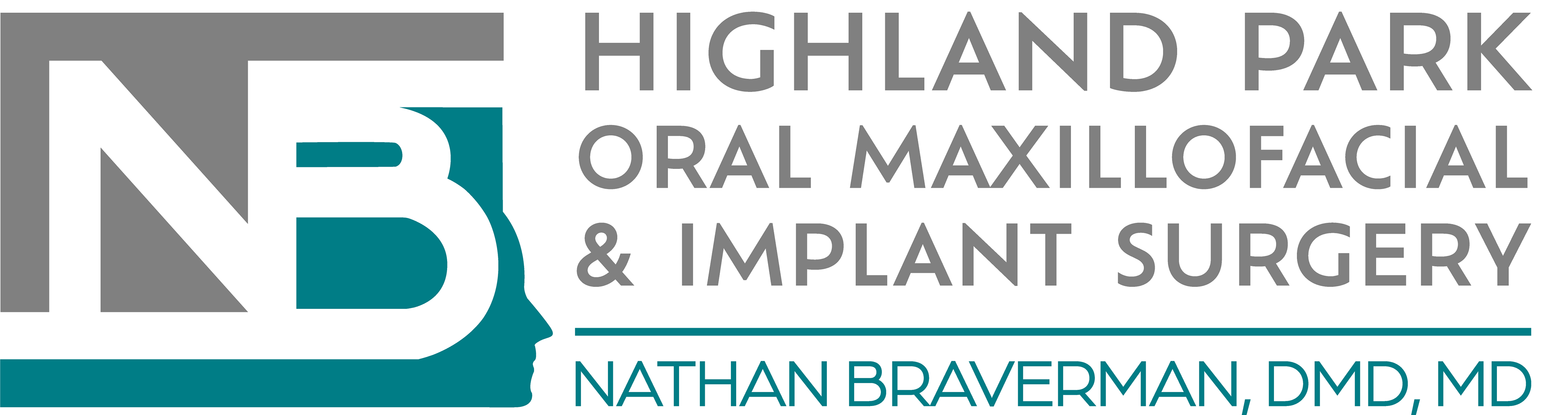
Our goal was to translate the precision, adaptability, and professionalism of oral surgery into a clean, modern brand system. We started with the logo, using the concept of negative space to reflect the surgeon's ability to operate within tight constraints and unique cases. The design conveys both simplicity and sophistication—qualities essential to the field of Oral and Maxillofacial Surgery.
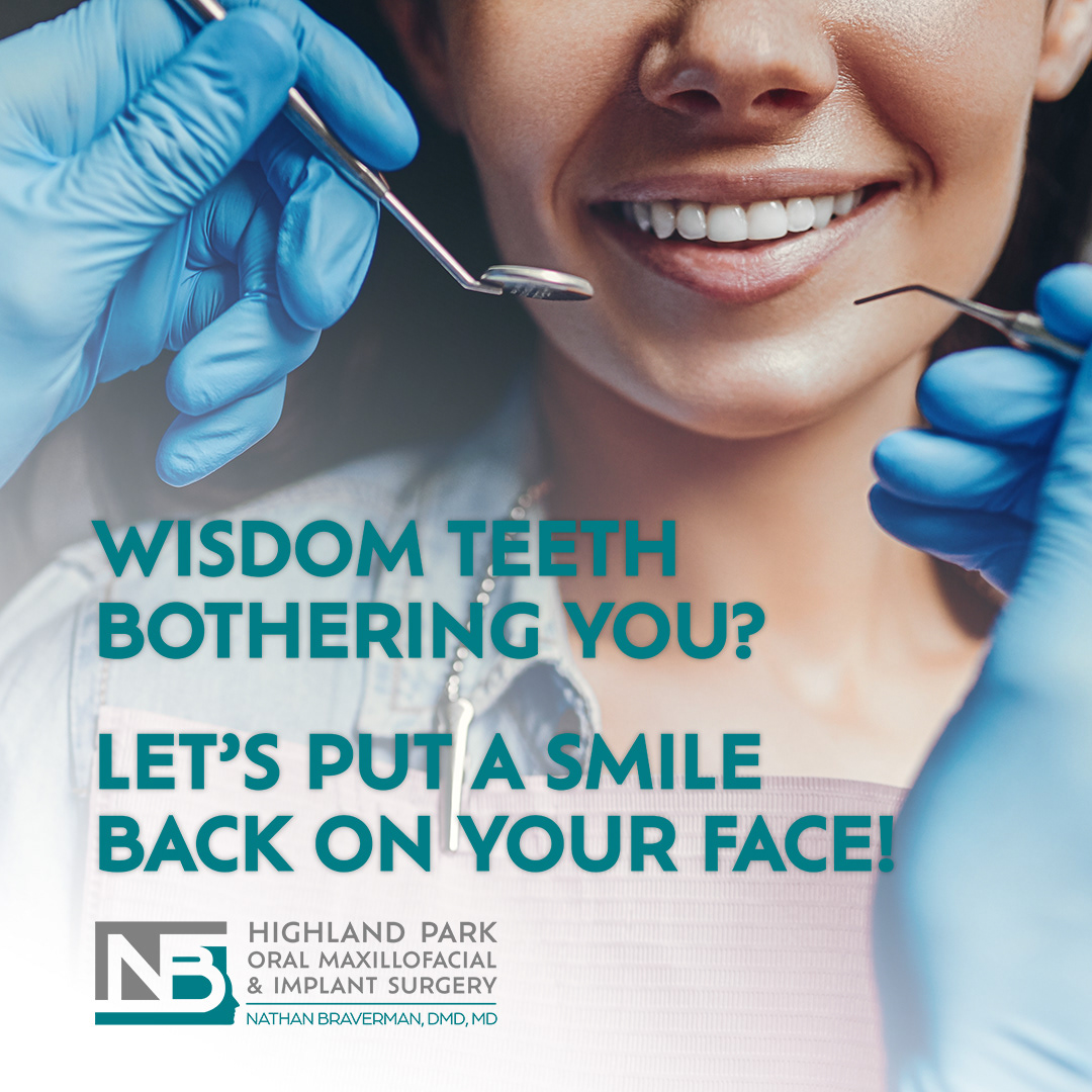
We selected a color palette of teal and grey based on principles of color theory. Teal communicates trust and calm, while grey adds a sense of stability and professionalism—together evoking the environment patients seek in surgical care.
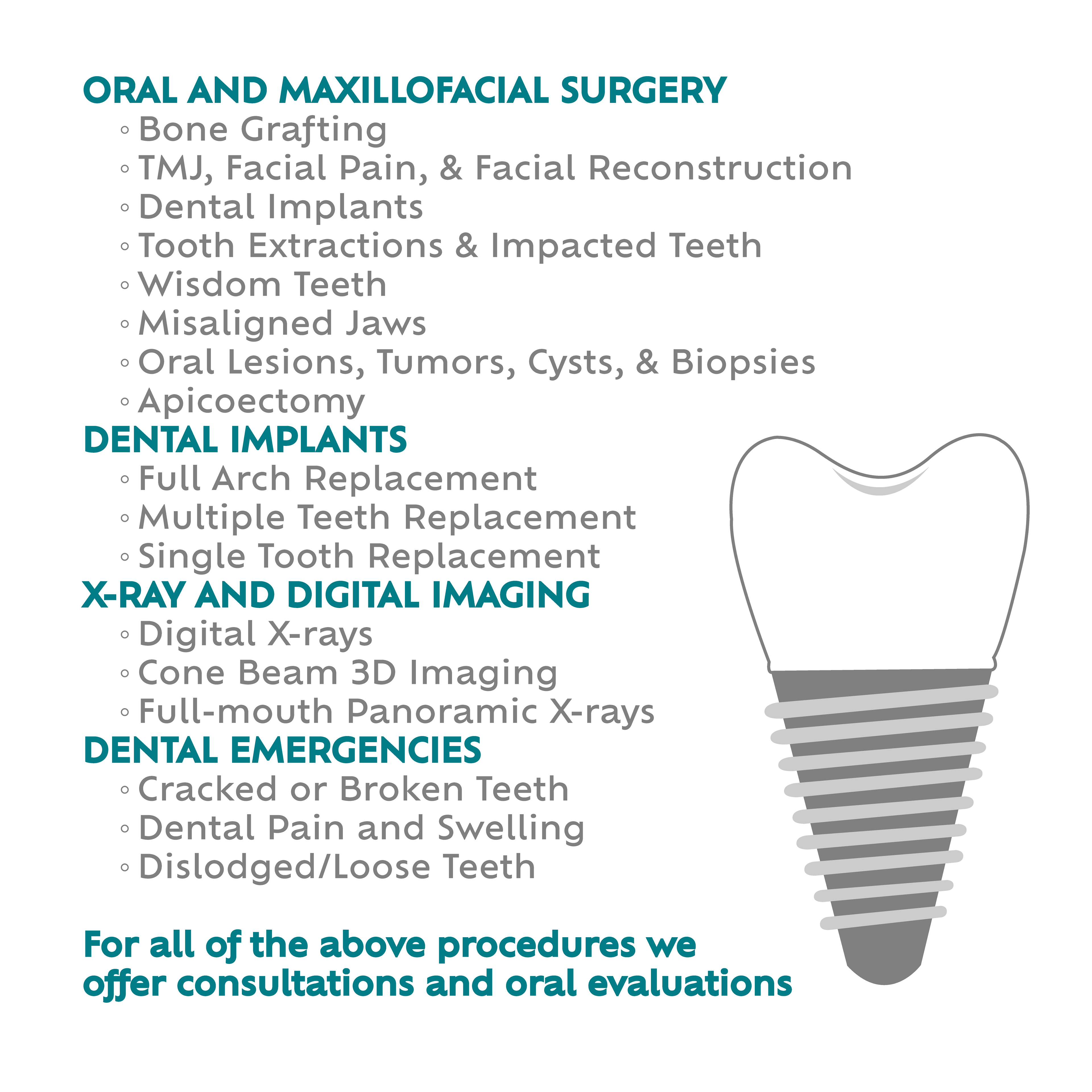
From the finalized logo and brand guidelines, we extended the identity across multiple touchpoints:
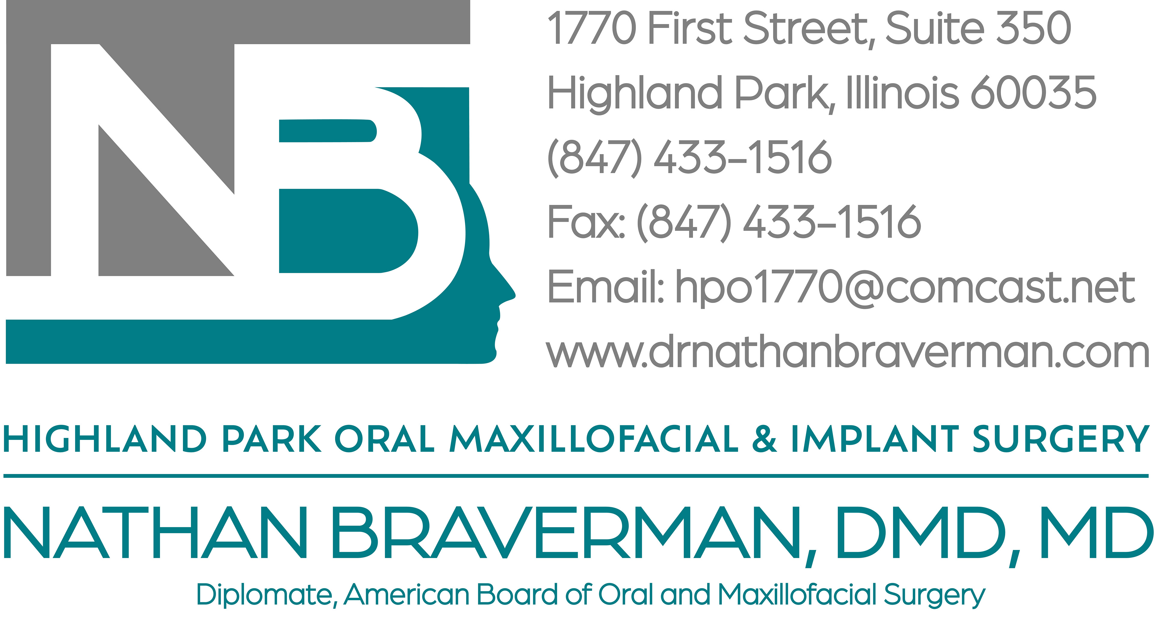
- A custom-designed business card
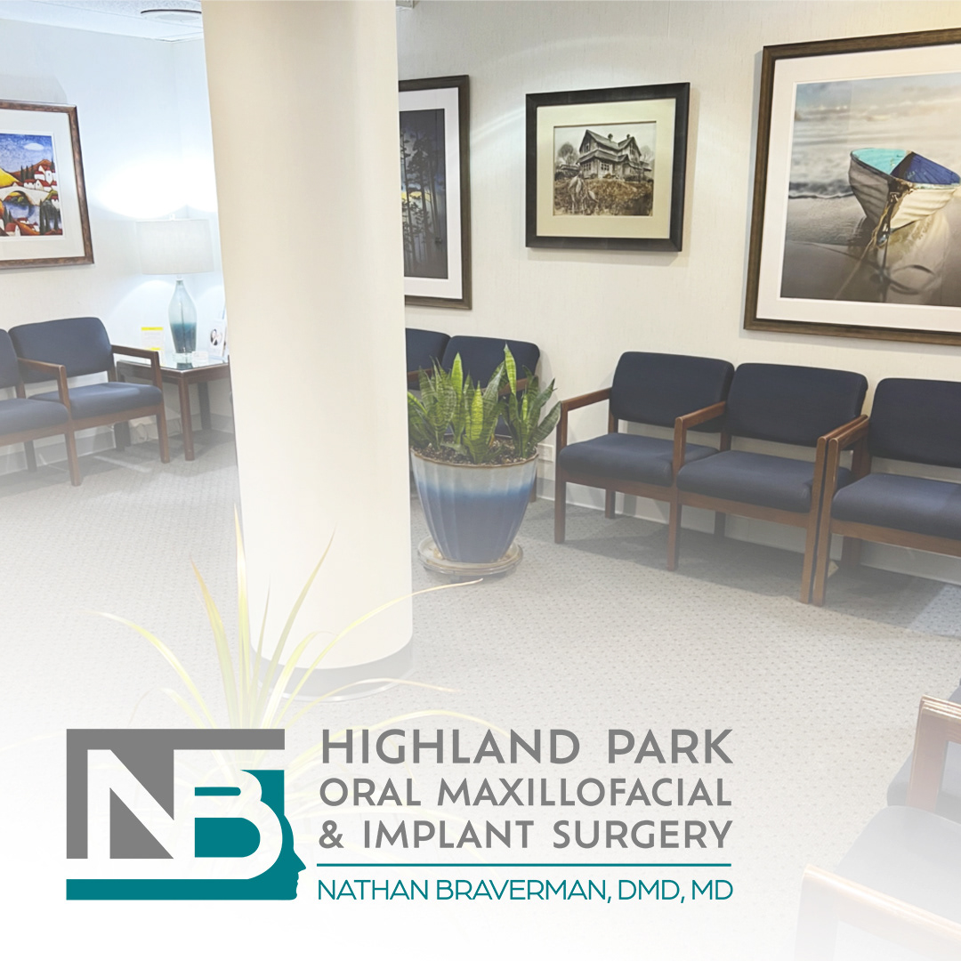
- A branded sign for the practice’s waiting room
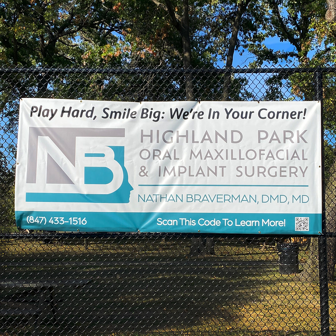
- A large-scale promotional banner placed at high-traffic pickleball courts in Highland Park
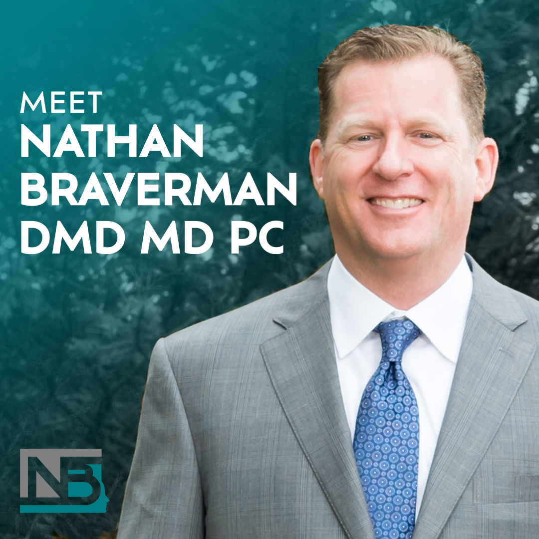
- A refreshed digital presence via Instagram and LinkedIn
This project marked not only the first formal branding effort for Highland Park Oral Surgery but also my own first full-scale identity design—from strategy to execution. Through this process, we transformed a legacy of surgical excellence into a brand that reflects its professionalism, trustworthiness, and continued growth.
Process:
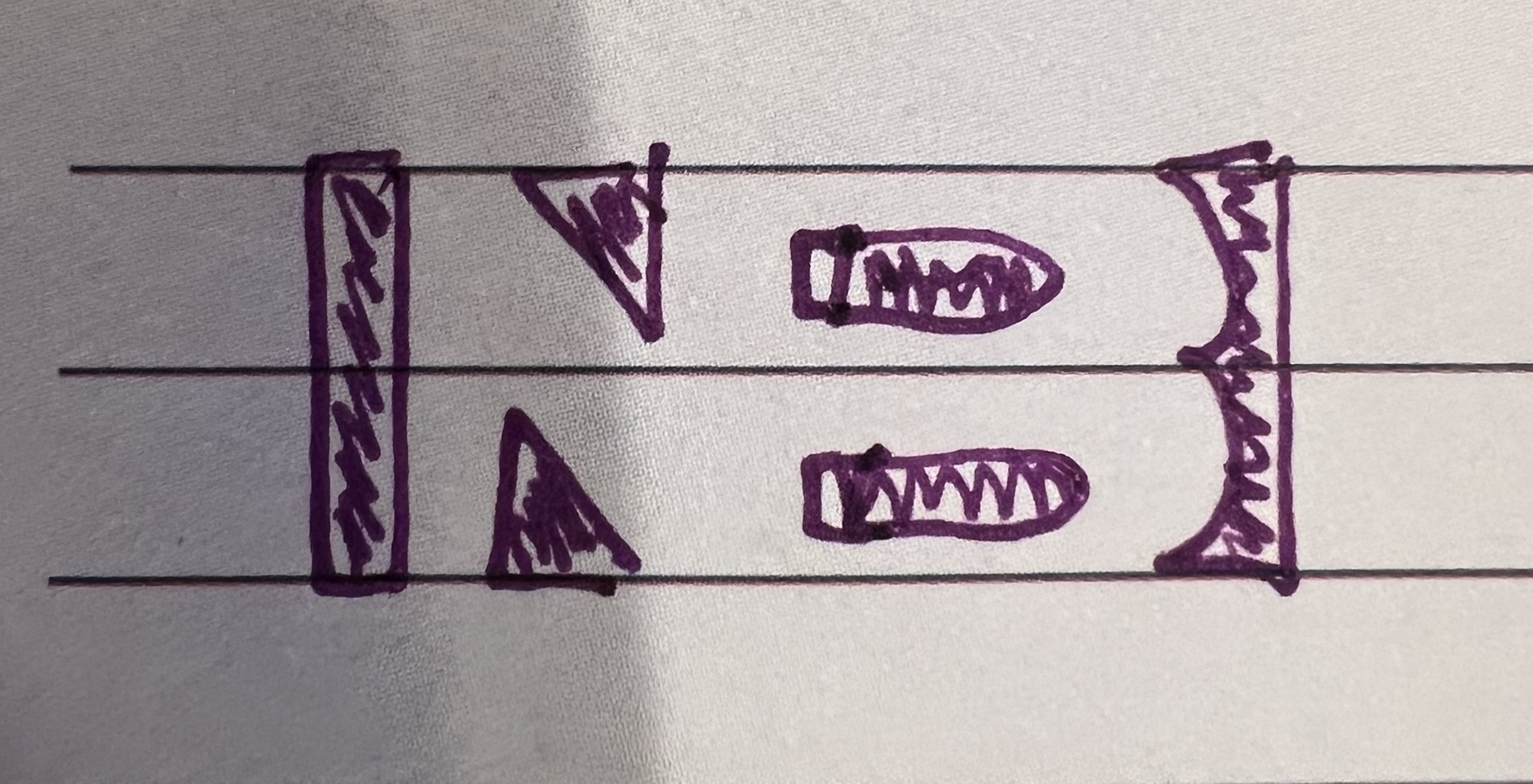
My design process begins with a conversation. Understanding the person and their business is essential, even when it's someone I know well—like my dad. While I already knew him, I needed to dive deeper into his oral surgery practice, learning what set it apart and how he envisioned it from both his perspective and his patients' view.
With that foundation, I moved to sketching. Using Negative Space as the core design concept, I experimented with multiple iterations to visually reflect his business philosophy. Once we agreed on a sketch, I transitioned to Adobe Illustrator to refine the logo. The biggest challenge was framing the "N" and "B" effectively. During the second concept review, we realized that extending the letters into a box-like structure best captured the intended vision.
While working in Illustrator, I also explored the color scheme. We tested different shades of blue, but none felt quite right. Revisiting those initial conversations helped me reassess color theory and identify the best fit—leading to our final choice of teal and gray in the third concept review.
Once the logo was finalized, I applied the branding across business cards, promotional banners, and social media, completing the cohesive visual identity.